Warm Minimalist Interior Design for Bay Area Homes
Use natural wood, tactile fabrics, soft curves, and earth tones to help buyers feel at home.

Warm Minimalist Interior Design for Bay Area Homes
Use natural wood, tactile fabrics, soft curves, and earth tones to help buyers feel at home.
Minimal Does Not Have to Feel Empty
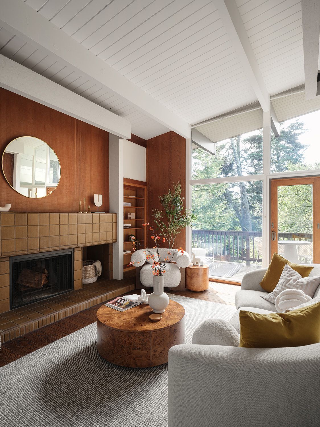
A buyer steps into the living room and sees white walls, a low gray sofa, and one metal floor lamp. The room is clean, but it feels cold. There is nowhere for the eye to settle and no suggestion of what an evening at home might feel like. Warm minimalist interior design solves that problem without filling every surface or asking the seller to redesign the house.
The approach keeps the visual clarity that makes minimal interiors appealing, then adds materials and shapes that feel comfortable: oak grain, nubby linen, woven wool, matte ceramic, and curved upholstery. Restrained earth tones replace sharp black-and-white contrast. The result still feels edited, but sunlight has texture to land on.
That distinction matters when preparing a home for sale. Buyers need enough openness to notice the room’s proportions, windows, and circulation. They also need enough warmth to imagine sitting down. Cold minimalism is a poor selling strategy because it can make even a well-proportioned room feel temporary.
Staging does not require a complete renovation. In many homes, the shift comes from changing a few visible layers: the main furniture, rug, lighting, textiles, and accessories. The architecture stays as it is. The atmosphere changes.
The goal is not to add more. It is to make every visible layer feel intentional and comfortable.
Start With Wood That Shows Its Natural Grain
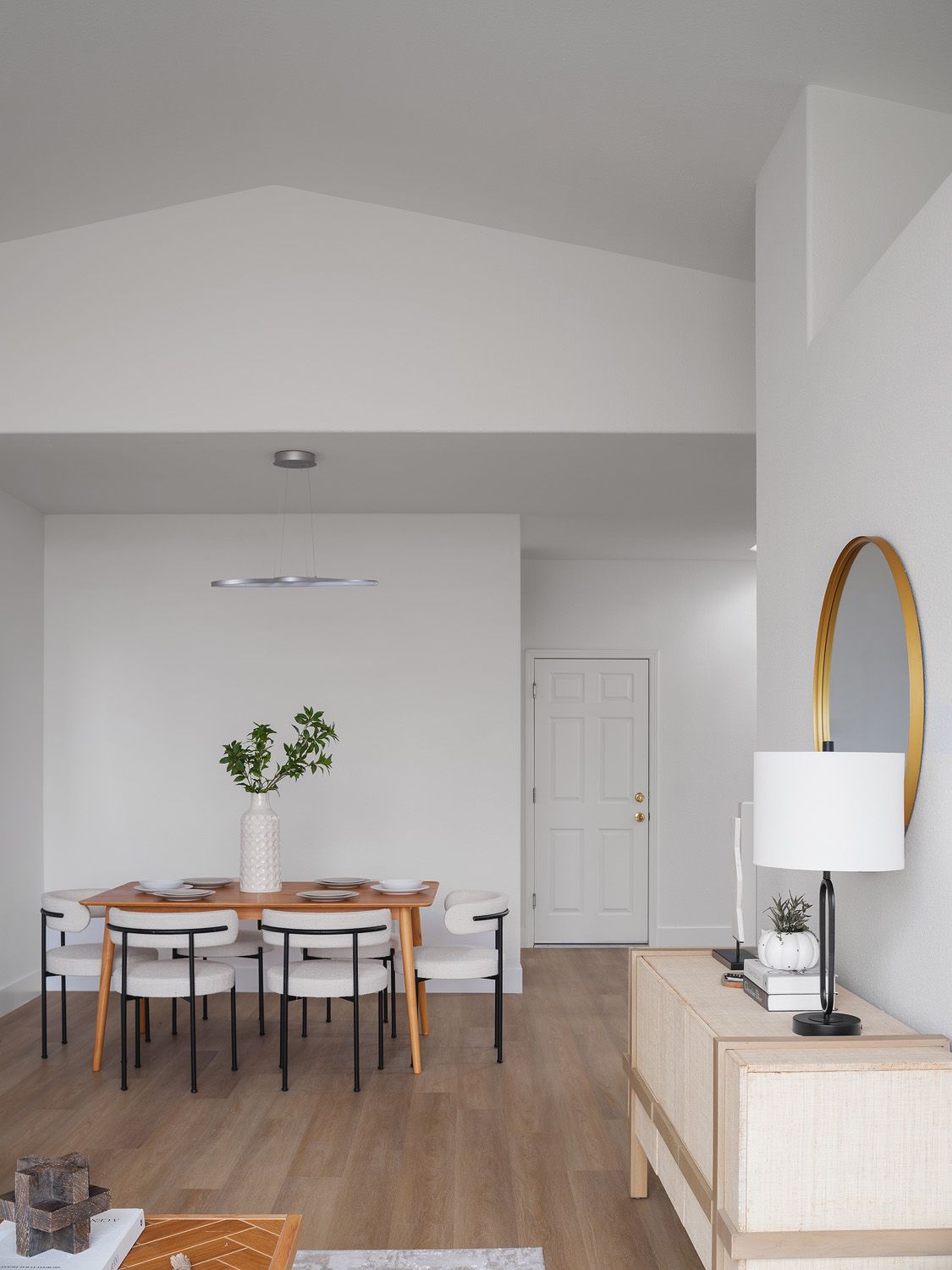
Warm wood gives a quiet room visual structure. An oak coffee table catches afternoon light differently from a glossy white table; the grain adds movement without introducing a busy pattern. Walnut brings deeper contrast, while pale ash can soften rooms with limited daylight.
Choose one dominant wood tone, then allow a related tone to appear once or twice. For example, pair a medium-oak dining table with lighter oak chair frames and a walnut bowl. Avoid matching every leg, frame, and cabinet finish. Exact repetition can make a staged room look packaged rather than lived in.
Scale matters as much as finish. A thick pedestal table can anchor an open dining area, but it may crowd a narrow room. In a compact space, use a table with slender legs so buyers can see more floor. That exposed floor creates breathing room in both the physical tour and the listing photos.
If the home already has strong wood elements, work with them. A reddish floor does not need another red-toned console. A quieter oak, flax textile, or off-white ceramic can reduce the visual heat. Similarly, dark kitchen cabinets often benefit from a pale wood stool or cutting board rather than more black accents.
Our opinion is straightforward: painted composite furniture should not lead a warm minimalist room. Use it sparingly, then let at least one substantial natural material carry the space.
Use Texture Where Buyers Will Feel It

Texture keeps neutral rooms from reading as flat. In a warm minimalism living room, the eye should move from a softly woven rug to a linen sofa, then toward a smooth wood table or matte ceramic vessel. Those surfaces create depth even when the palette stays within cream, sand, mushroom, and brown.
Begin with the largest textile. A rug should visually connect the seating rather than float beneath the coffee table like a small island. Choose a low or medium pile with visible weave; heavy shag can hide floor condition and look untidy in close photographs. Wool, wool blends, and flatwoven textures usually create a cleaner outline.
Next, vary the upholstery. If the sofa has a tight linen weave, add one boucle or brushed-wool chair rather than six matching textured pillows. A folded throw can soften an armrest, but it should not cover half the sofa. Buyers still need to understand the furniture’s shape and available seating.
Window treatments deserve restraint. Sheer or lightweight woven panels diffuse hard daylight and reduce glare without darkening the room. Hang them cleanly, clear the glass, and avoid bulky fabric pooling on the floor. When air moves through an open window, a light linen panel gives the room a subtle sense of motion.
Texture should feel deliberate, not decorative for its own sake. Two or three distinct surfaces in one view usually communicate more than a pile of small accessories.
Soften Straight Architecture With Curved Forms
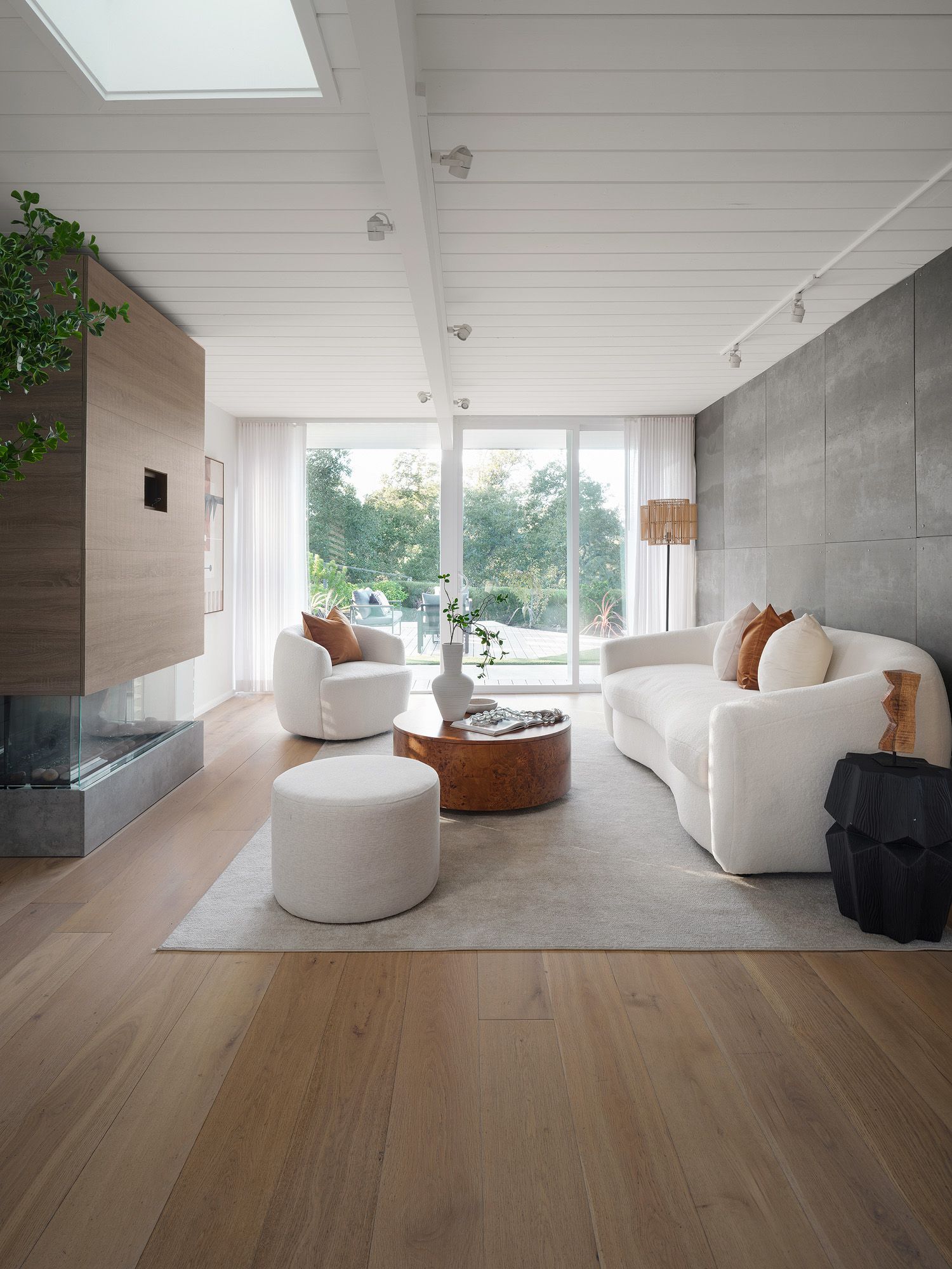
Many Bay Area homes contain strong horizontal and vertical lines: rectangular windows, long kitchen islands, square fireplaces, and open-plan walls. Repeating those angles in every piece of furniture can make the room feel rigid. A few curves interrupt the grid and help guide the eye through the space.
Use curves where they remain easy to read. A round dining table clarifies circulation in a square breakfast area. An oval coffee table allows a smoother path between the sofa and a nearby doorway. A barrel chair can soften the edge of a large sectional without taking over the composition.
Do not turn every object into an arch or blob. One broad curve works better than a collection of rounded furniture, circular pillows, looped sculptures, and wavy mirrors. The contrast gives the curve its effect.
Pay close attention to traffic paths during staging. Buyers should not have to angle their shoulders around a chair or step sideways between a table and wall. Leave direct walking routes from the entry to the main seating area, from the dining space to the kitchen, and toward exterior doors. Clear circulation also gives the photographer useful sightlines.
A curved silhouette adds comfort before anyone touches the furniture. The eye reads the softer edge, while the open floor around it preserves the room’s scale.
A curve works because the room around it stays quiet.
Build an Earth-Tone Palette Without Making It Muddy
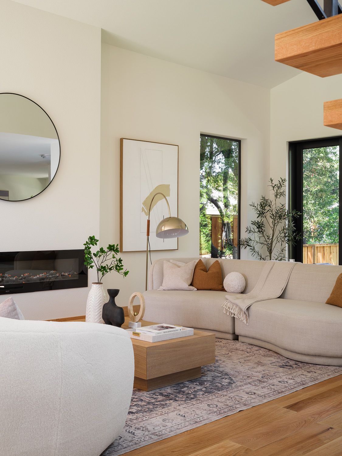
Warm minimalism relies on a narrow palette, but narrow does not mean beige from wall to wall. Start with a light base, add one grounded middle tone, and finish with a darker accent. Warm white, clay, and walnut form one useful sequence. Flax, muted olive, and deep brown form another.
The undertones need to agree with the fixed finishes. Cream upholstery can look yellow beside a cool gray floor, while blue-gray pillows may drain the warmth from honey-colored wood. Place fabric samples near the floor, cabinetry, and wall paint, then view them in daylight and under the home’s lamps. Color shifts as the light changes.
Black still has a role, but it should draw fine lines rather than dominate the room. A slim lamp stem, narrow picture frame, or small side table can sharpen a soft palette. Large blocks of black upholstery often absorb light and become heavy focal points in listing images.
Greenery can connect the earth tones, provided the plants fit the scale. A single upright plant near a bright window reads more clearly than several small pots scattered across shelves. Remove dusty leaves and anything with a strong soil smell before photography or showings.
For sellers studying Bay Area interior design, the practical lesson is to respond to the home’s existing light and materials instead of imposing a fashionable palette. A room with cool coastal light needs a different balance from one receiving intense afternoon sun.
Style for the Camera and the In-Person Tour
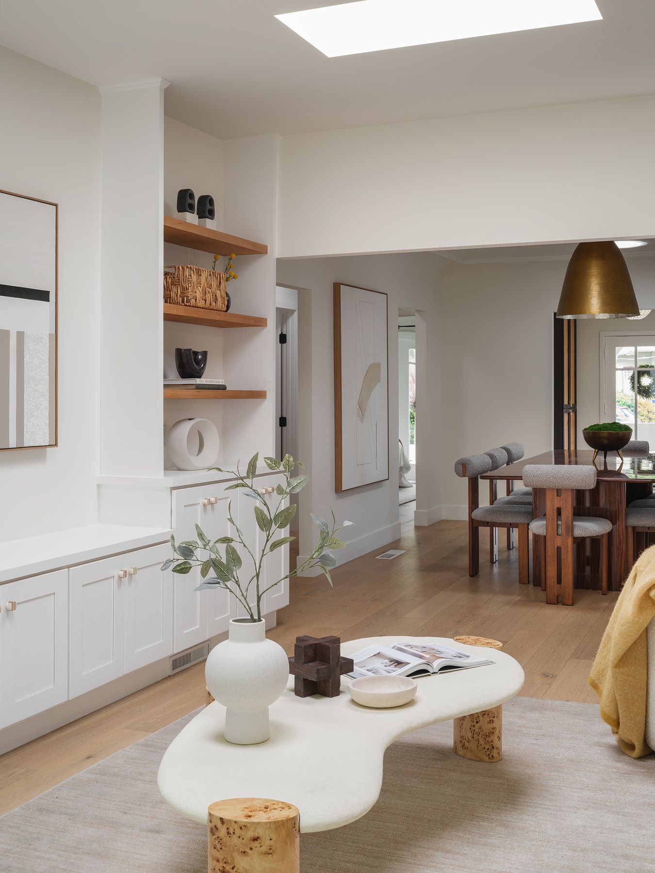
A room can feel pleasant in person and still look cluttered through a camera lens. Photography compresses accessories into a smaller frame, strengthens contrast, and makes crooked edges easier to spot. Warm minimalist staging accounts for both experiences.
Start by identifying what the photograph needs to explain. In a living room, that may be the relationship between the windows, fireplace, and seating area. In a bedroom, it may be the bed wall and the walking space on each side. Position furniture so those features remain visible from the doorway and from likely camera angles.
Then remove objects that break the outline of the room. Tangled cords, clusters of remotes, tall countertop appliances, and crowded open shelves create visual noise. Keep a few tactile details instead: a linen-covered book, a shallow wood bowl, or one branch in a matte vessel. These objects catch light without hiding the surface beneath them.
Lighting should create an even, welcoming glow. Open window coverings, replace visibly mismatched bulbs, and switch on lamps in darker corners. Avoid relying on one harsh ceiling fixture, especially when it casts sharp shadows across faces of cabinets or furniture.
This is where interior design for home selling differs from decorating for daily life. Personal comfort allows collections, equipment, and convenience items to stay visible. Staging edits those layers so buyers can read the property first. See how Mia’s Home Staging applies that restraint across different layouts in our portfolio.
Make Focused Changes Instead of Redesigning Everything
Walk through the home as a buyer would, starting at the front door. Notice the first large shape, the brightest window, and any narrow passage. Listen for rooms that echo because they lack textiles. Pay attention to surfaces that feel cold or overly glossy under your hand.
Choose the few rooms that carry the listing story. The living room, dining area, primary bedroom, and main entry often need the clearest visual direction. Secondary spaces can remain simpler as long as buyers understand their function and scale.
In each priority room, make one change in each of four layers: material, texture, shape, and color. That might mean an oak table, a woven rug, a curved chair, and two muted olive pillows. Remove competing pieces before adding anything else. Editing usually does more than shopping.
Sellers also need to decide whether they require physical staging or a consultation. Physical staging sets up vacant or partially furnished rooms with selected furniture and accessories. A consultation works with the seller’s existing pieces and identifies what to remove, move, or supplement. Mia’s Home Staging offers both approaches; review our staging services to choose the level of support that fits the property.
Warm minimalism works because it holds two ideas at once. The rooms stay open enough for buyers to examine, yet they carry enough wood grain, woven texture, soft light, and curved form to feel inhabited. That balance invites attention without demanding it.
Frequently Asked Questions
- What is warm minimalist interior design?
- Warm minimalist interior design combines uncluttered layouts with natural wood, tactile textiles, soft curves, warm lighting, and restrained earth tones. It maintains visual simplicity without making a room feel stark or impersonal.
- Can I create a warm minimalist interior without replacing all my furniture?
- Yes. Start by removing visual clutter, then focus on a few high-impact layers such as a textured rug, wood table, soft window panels, rounded accent chair, and coordinated earth-tone accessories. A staging consultation can identify which existing pieces should remain.
- Which colors work well in a warm minimalist living room?
- Warm white, flax, sand, clay, mushroom, muted olive, walnut, and deep brown can work well. Choose shades that coordinate with the home’s flooring, cabinetry, wall color, and natural light rather than applying the same palette to every property.
- How does warm minimalism help when selling a home?
- It keeps rooms visually open while adding enough texture, warmth, and functional furniture to communicate scale and use. The approach can also reduce distractions in listing photography and help buyers focus on the property’s architecture.
- Should I choose physical staging or a staging consultation?
- Physical staging suits vacant or sparsely furnished properties that need furniture and accessories. A consultation may suit an occupied home when the seller can use existing pieces with targeted editing, rearrangement, and selected additions.


