California Coastal Interior Design Without Clichés
A restrained guide to warm neutrals, natural texture, quiet blue accents, and lighter rooms.
California Coastal Interior Design Without Clichés
A restrained guide to warm neutrals, natural texture, quiet blue accents, and lighter rooms.
Coastal Style Should Begin With Light, Not a Theme
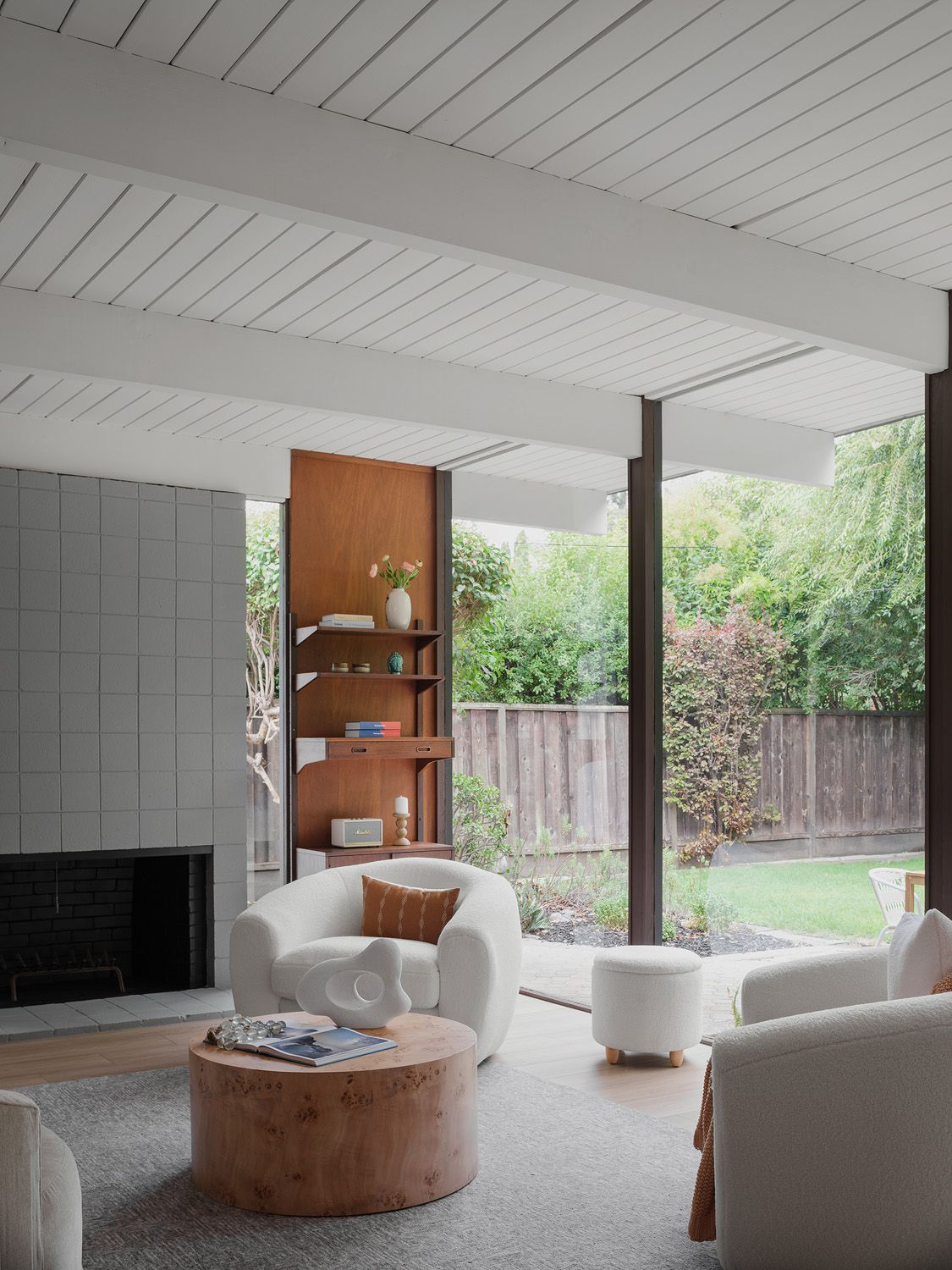
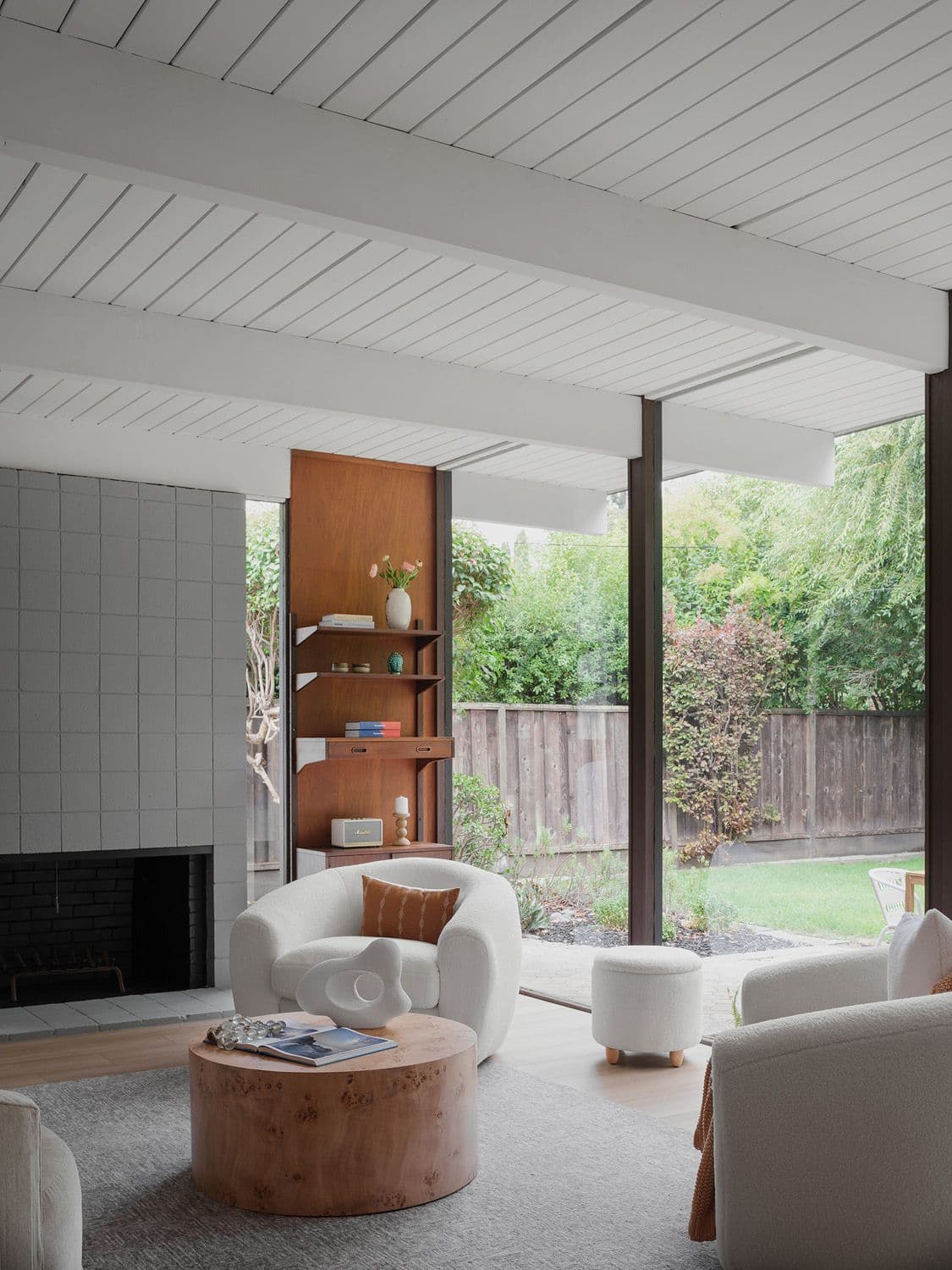
Late-morning sun crosses a pale oak floor. An oatmeal sofa keeps the room soft, while one blue-gray pillow picks up the cooler light near the windows. There are no anchors on the wall, no rope around a lamp base, and no bowl filled with shells. Yet the room still feels connected to the California coast.
That distinction matters when you’re preparing a Bay Area property for sale. California coastal interior design works best when it reflects the coast’s light, texture, and ease rather than its souvenirs. The goal isn’t to make a house look like a beach rental. It’s to help buyers experience a bright, settled interior with room to breathe.
Our view is specific: coastal style should function as a way of handling light, not as a decorating theme. In a listing, that means using sun-washed colors, tactile natural materials, quiet blue notes, and furniture that doesn’t block the architecture. These choices can give a home a relaxed visual rhythm without asking buyers to adopt a particular lifestyle or taste.
Coastal style should function as a way of handling light, not as a decorating theme.
Build the Palette Around the Home’s Actual Daylight
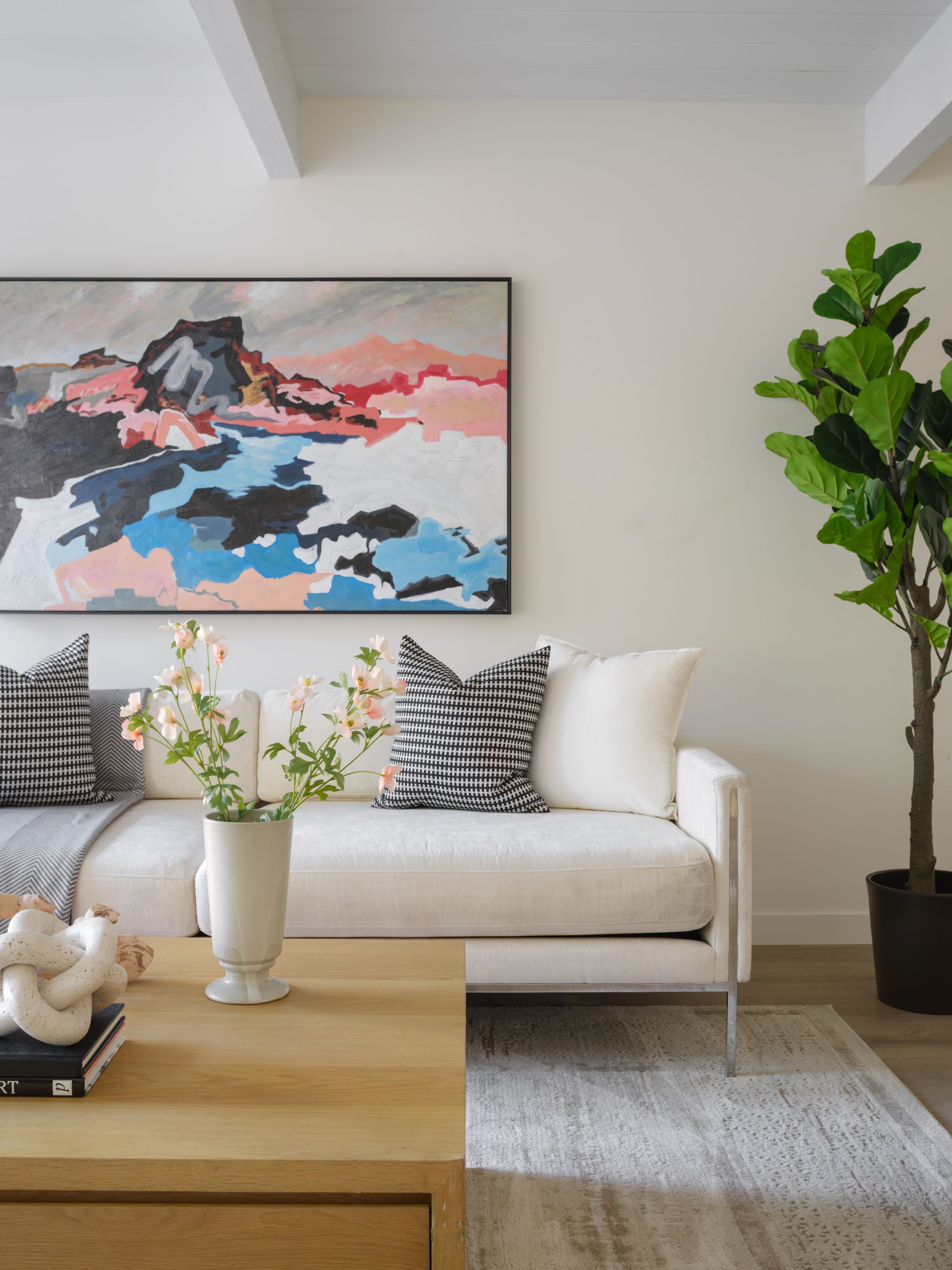
Start by standing in each main room during daylight hours. Notice whether the walls read creamy, gray, yellow, or slightly green. Look at the floor, too. Honey-toned wood reflects light differently from cool concrete, dark walnut, or gray tile. A coastal palette needs to respond to those fixed surfaces rather than fight them.
Warm white, soft sand, flax, mushroom, and pale taupe create a useful base because they preserve brightness while adding more depth than stark white. In a room with cool northern light, a chalky blue-white can feel thin and cold. A warmer neutral gives the walls a quieter glow and makes linen, wool, and unfinished wood look richer in photographs.
Sun-washed does not mean faded everywhere. Contrast gives the eye a place to land. A charcoal metal window frame, dark bronze lamp, walnut side table, or black-and-cream artwork can sharpen an otherwise pale room. Without that counterpoint, the listing photos may blur into one beige surface.
Before repainting, test large samples beside the floor, cabinetry, and stone. View them in the morning and again when the room is dimmer. Bay Area interior design has to account for changing natural light, especially in homes where fog, neighboring buildings, deep overhangs, or mature trees alter the color throughout the day.
Use Natural Texture Where Buyers Can See the Detail
Natural materials give coastal rooms their tactile character. Think washed linen, slubby cotton, matte ceramic, pale oak, woven wool, cane, and a small amount of seagrass. These surfaces catch light differently: linen absorbs it, glazed pottery reflects it, and a wool rug softens both sound and footfall.
The key is selection. A linen sofa beside a woven rug and a smooth oak table creates enough variation. Add rattan chairs, a jute pendant, three baskets, and a driftwood sculpture, and the room starts performing a theme. Repetition makes the materials feel less considered.
Texture also matters in listing photography. A tightly cropped image can show the edge of a nubby pillow, the grain in a wood console, or the soft folds of an ivory curtain. Those details add dimension without making the room busy. Choose substantial pieces over piles of small accessories; one broad ceramic bowl usually reads better than a tray crowded with decorative objects.
Keep condition in mind. Frayed baskets, scratched tables, and heavily wrinkled linen don’t communicate ease. They communicate wear. Coastal home staging should feel relaxed but maintained, with clean upholstery, smooth bedding, and natural materials that still have a crisp silhouette.
Treat Blue as an Accent, Not the Entire Story
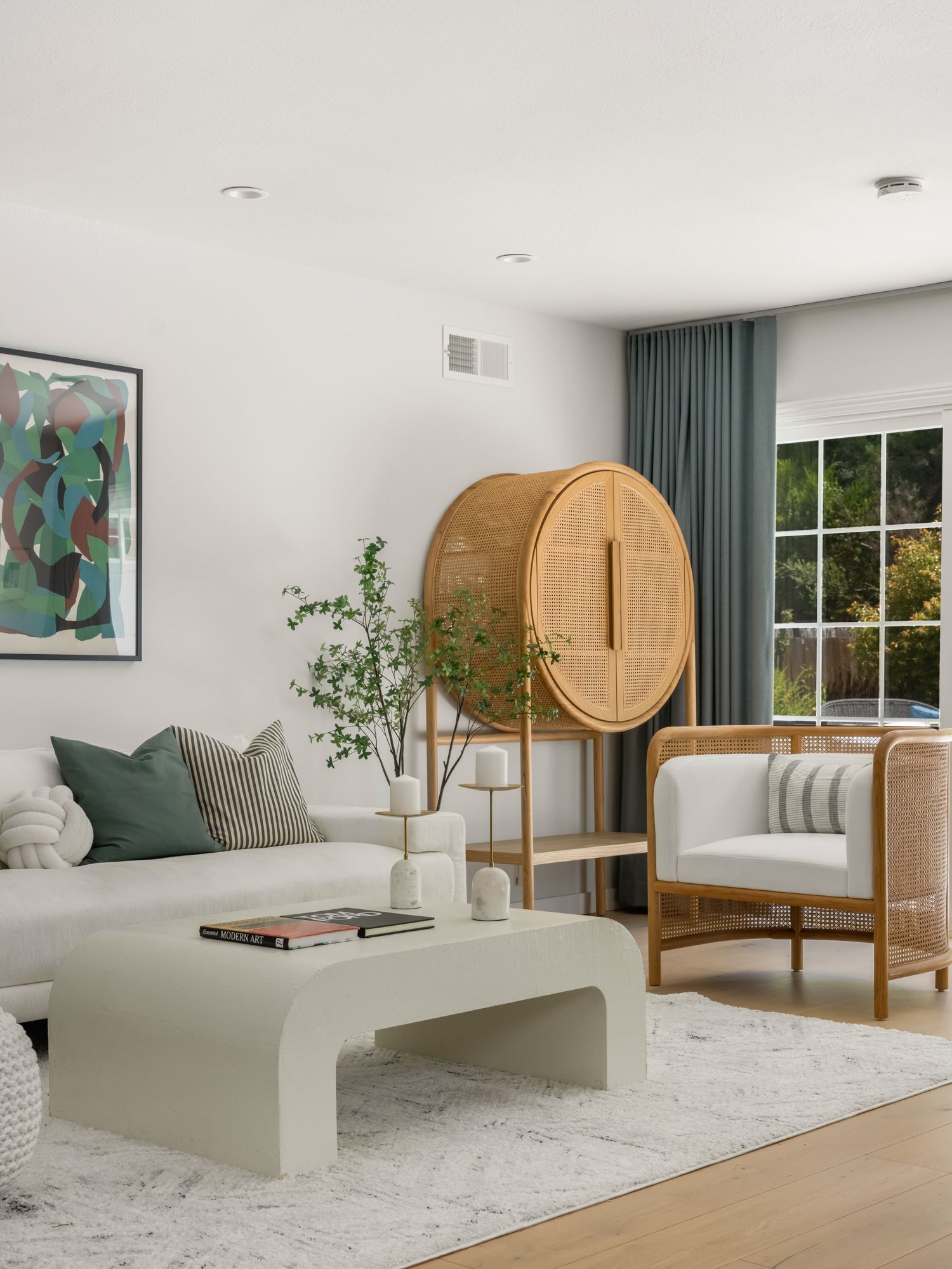
Blue is useful, but it needs restraint. Choose shades that could plausibly appear in the light around the property: misty blue-gray, muted denim, deep slate, or a green-blue with plenty of gray in it. These colors sit comfortably beside warm wood and cream upholstery without shouting “coastal.”
In a California coastal living room, one blue-gray pillow, an abstract artwork with a cool passage, or a ceramic lamp may be enough. Spread the color across a few visual levels rather than matching every item. A low textile, mid-height accessory, and small note in the artwork will feel connected without looking like a set.
Avoid relying on bright turquoise, navy-and-white stripes, or repeated coral motifs to establish the concept. Those cues are immediate, but they narrow the buyer’s interpretation of the home. They can also compete with landscape views, tile, or colorful planting outside the windows.
If the room already contains a strong permanent color, let that lead. Blue kitchen cabinets, green tile, or rust-toned flooring may call for quieter accessories. Staging should organize what the house already offers, not layer a second identity over it.
Choose Furniture That Opens the Sightlines
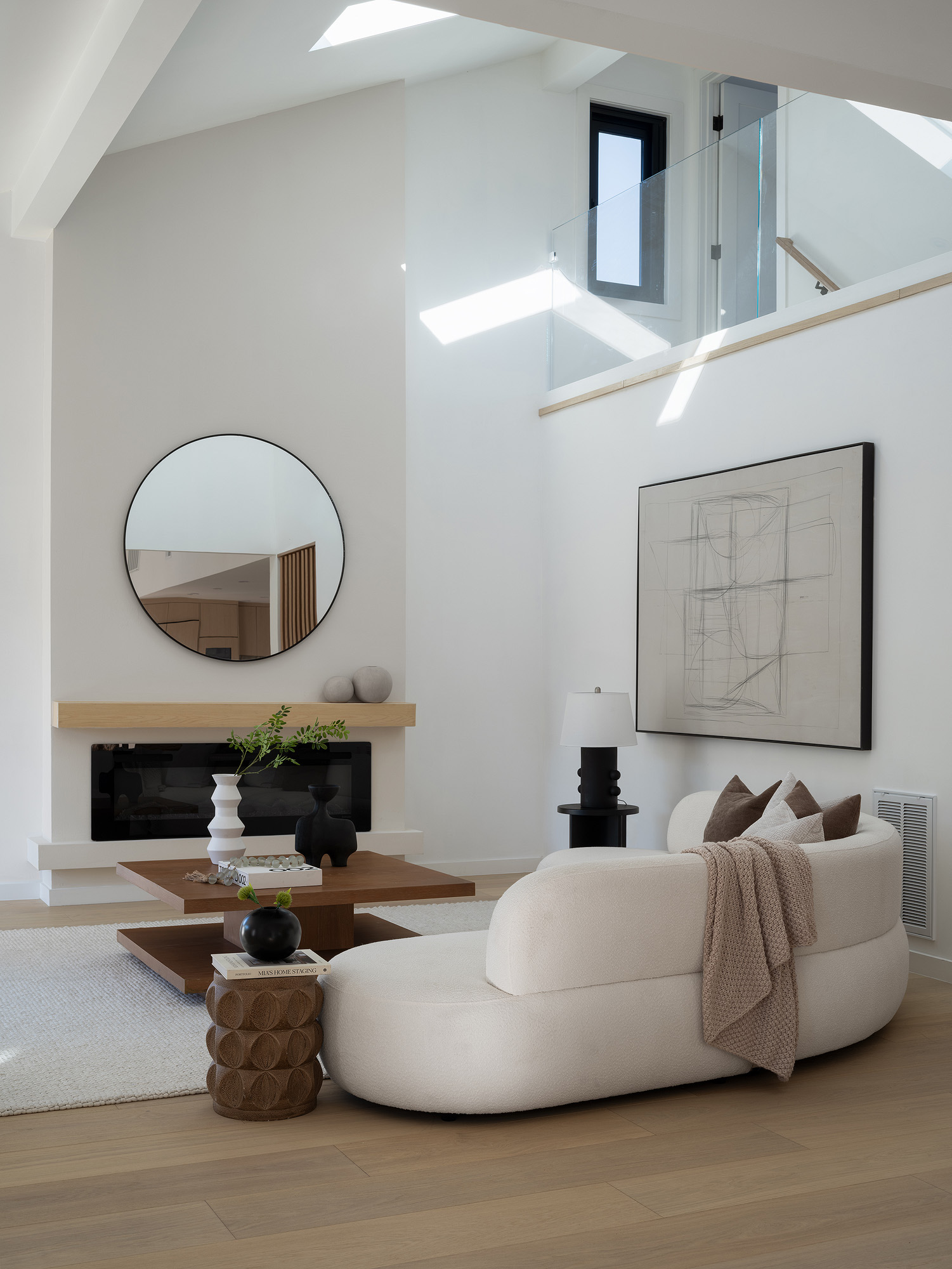
Coastal rooms feel easy partly because air and light can move through them. Furniture scale creates that effect more reliably than decorative objects. A sofa with a lower back can preserve a window line. Chairs with open arms reveal more floor. A coffee table on slim legs allows light to pass underneath.
This doesn’t mean every piece should look delicate. A room still needs visual weight. Anchor the seating area with a wool rug, then balance one grounded sofa with lighter chairs and a simple wood table. The mix should feel stable when you enter, but not crowded around your knees as you walk through.
Pay close attention to pathways. Buyers should be able to move from the entry to the main seating area without turning sideways around an ottoman or clipping the corner of a console. In photographs, leave enough floor visible to clarify the room’s width. In person, keep the route to windows, doors, and adjoining spaces obvious.
Scale also helps buyers understand function. An undersized rug can make a generous living room look fragmented, while too much furniture can make an ordinary room feel constrained. Staging, meaning setting up rooms with selected furniture and accessories so buyers can picture living there, should explain the space at a glance.
For examples of how proportion and sightlines shape listing rooms, browse our portfolio. The most effective arrangements often use fewer pieces than homeowners expect, but each item has a clear role.
The room should explain its scale before the buyer starts measuring it.
Apply the Look Room by Room, With a Lighter Hand
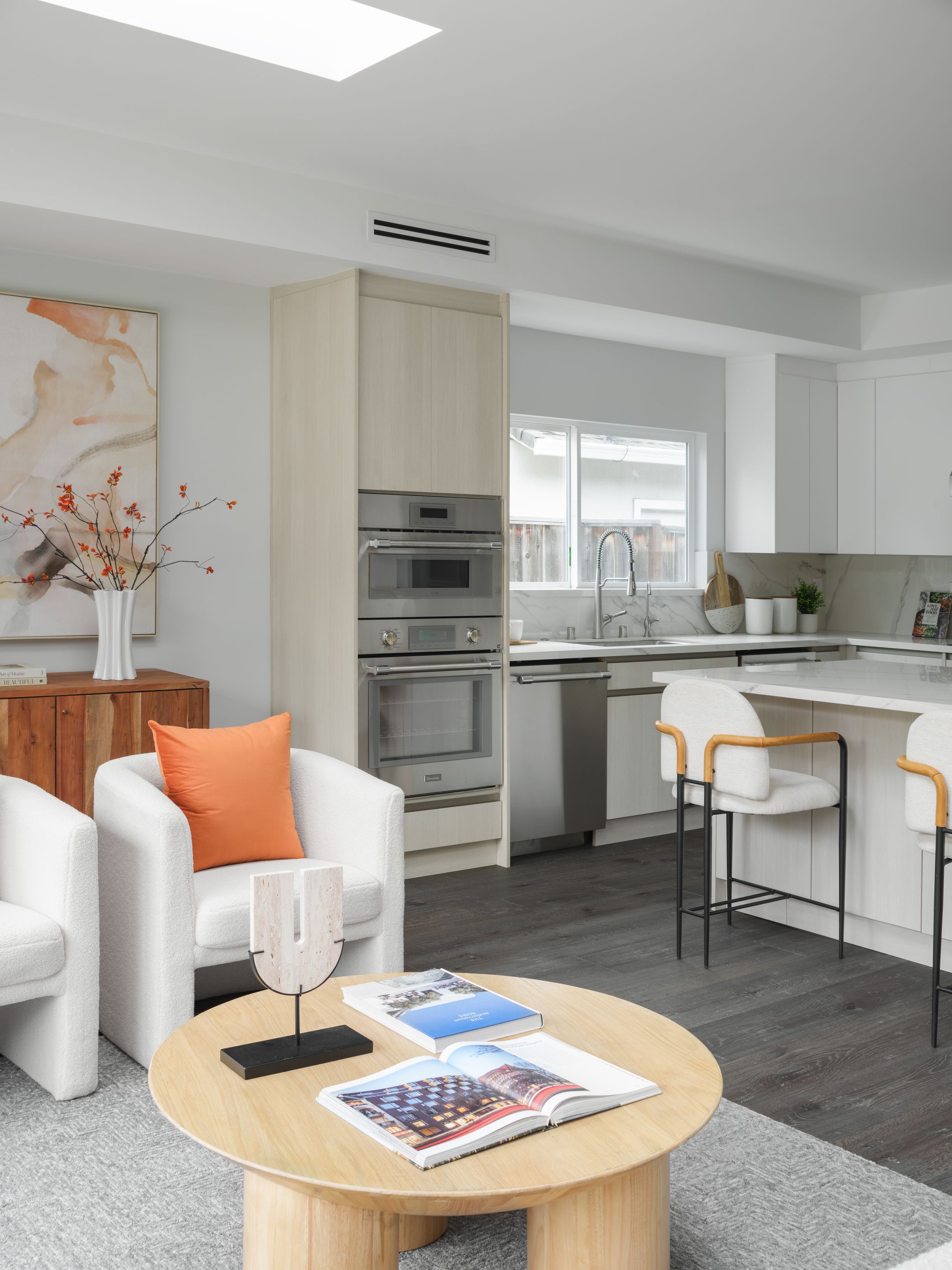
In the living room, begin with the largest surfaces: sofa, rug, curtains, and artwork. An oatmeal sofa, warm ivory rug, and pale wood table can establish the direction. Then add contrast through one dark lamp or framed artwork. Keep window treatments sheer enough to diffuse the light, but long and structured enough to avoid a flimsy appearance.
In the dining area, resist the urge to fill the table with place settings. A matte ceramic vessel, a low branch, or a shallow bowl leaves the wood grain visible and keeps the view across the room open. Woven dining seats can add texture, though a full set of matching rattan pieces may push the scheme toward resort styling. Mixing upholstered end chairs with simpler side chairs can create a more residential feeling.
Bedrooms need softness, not layers of themed bedding. Use crisp cotton or linen-look bedding in warm white, then introduce sand, clay, or muted blue through a folded coverlet and one or two pillows. The fabric should look touchable under soft lamp light. Clear the nightstands except for a lamp and one compact object; buyers need to see usable surface area.
Bathrooms benefit from the same edit. Folded white towels, a small wood stool, and one restrained plant can warm tile and stone. Skip glass jars of shells, blue liquid soap chosen only for color, and stacks of decorative towels that crowd the counter. Clean grout, reflective fixtures, and an uncluttered mirror will do more for the space than a coastal vignette.
The kitchen usually needs the least styling. Remove countertop appliances that interrupt long work surfaces. Keep one cutting board, a ceramic bowl, or a small branch where it helps define scale. If the cabinetry is dark, pale wood and off-white accessories can lift the room; if the kitchen is already light, introduce a small amount of darker contrast so the counters don’t disappear in photos.
A professional plan should adjust these choices to the architecture, existing finishes, and likely buyer expectations. Mia’s Home Staging offers both physical staging and design consultation; you can review the available approach on our services page.
Edit Out the Clichés Before the Photographer Arrives
Once the main rooms are arranged, walk through with a camera rather than relying only on your eye. Phone photos flatten a space in ways that resemble listing images. Look for repeated stripes, clusters of woven objects, oversized greenery, blue accents appearing in every frame, or pale furniture merging into pale walls.
Then listen to the room. A bare space with hard floors can echo; a wool rug and lined curtain will soften the sound. Notice scent as well. Strong coconut candles or ocean-scented sprays turn the coastal idea into a literal experience and may distract buyers. Clean, neutral air is the better choice.
Remove anything that names the theme: beach signs, model boats, coral replicas, shell frames, rope knots, and typography about coastal living. You don’t need those objects once the palette, materials, and furniture are doing the work. The same rule applies to excess accessories. If an object doesn’t improve scale, balance, texture, or function, it probably doesn’t need to appear in the listing.
California coastal interior design can make a Bay Area home feel brighter and more spacious, but only when it respects the property in front of you. Keep the sunlight, tactile materials, quiet color, and visual breathing room. Leave the costume behind.
Frequently Asked Questions
- What colors work for California coastal interior design?
- Start with warm, sun-washed neutrals such as ivory, flax, sand, mushroom, or pale taupe. Add muted blue-gray selectively, and include a small amount of dark contrast through lighting, artwork, or wood furniture.
- How do I create a coastal look without beach décor?
- Use natural materials and coastal colors without literal symbols. Linen, wool, pale wood, matte ceramics, and restrained blue accents can suggest the coast without shells, rope, model boats, or beach-themed signs.
- Does coastal home staging work for every Bay Area property?
- It can work when the palette responds to the home’s existing flooring, cabinetry, stone, and natural light. The design should clarify the property rather than impose a theme that conflicts with its architecture.
- What should I change first in a California coastal living room?
- Begin with furniture scale and sightlines. Remove pieces that block windows or pathways, then use a warm neutral base, natural texture, and a limited number of muted blue accents.


