Best Interior Paint Colors for Selling a House
A seller’s guide to warm neutrals, muted color, and paint choices that hold up in Bay Area summer light.

Best Interior Paint Colors for Selling a House
A seller’s guide to warm neutrals, muted color, and paint choices that hold up in Bay Area summer light.
Summer Light Changes How Paint Sells
The best interior paint colors for selling a house in the Bay Area are not always the colors that look good on a tiny fan deck. Summer light is stronger. Listing photos get sharper. Pale walls can turn chalky, gray walls can feel flat, and a color that looked soft in winter may read yellow by noon.
Before you paint for a summer listing, stand in the room at three times of day. Morning fog gives walls a cool cast. Midday sun bounces off pale flooring and white countertops. Late afternoon light warms everything, especially rooms with oak, maple, brass, or cream stone. Paint sits inside that light; it does not behave alone.
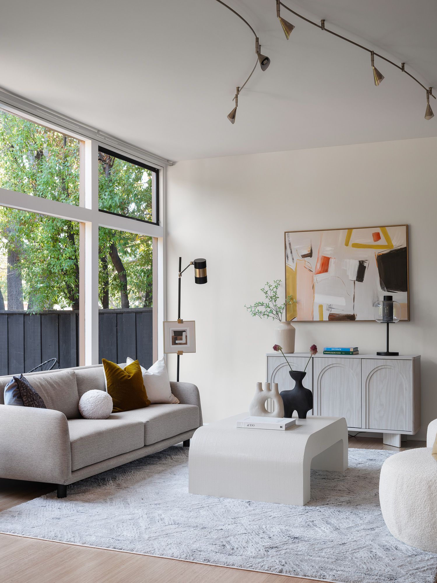
Here is our point of view for Summer 2026: the safest high-end direction is not pure white. It is a warm, low-chroma neutral with enough beige, clay, or mushroom in it to hold the room together on camera. Clean, yes. Empty, no.
For Summer 2026 listings, pure white is often less expensive-looking than a quiet warm neutral with depth.
The 2026 Shift: Less Cool Gray, More Warm Mineral
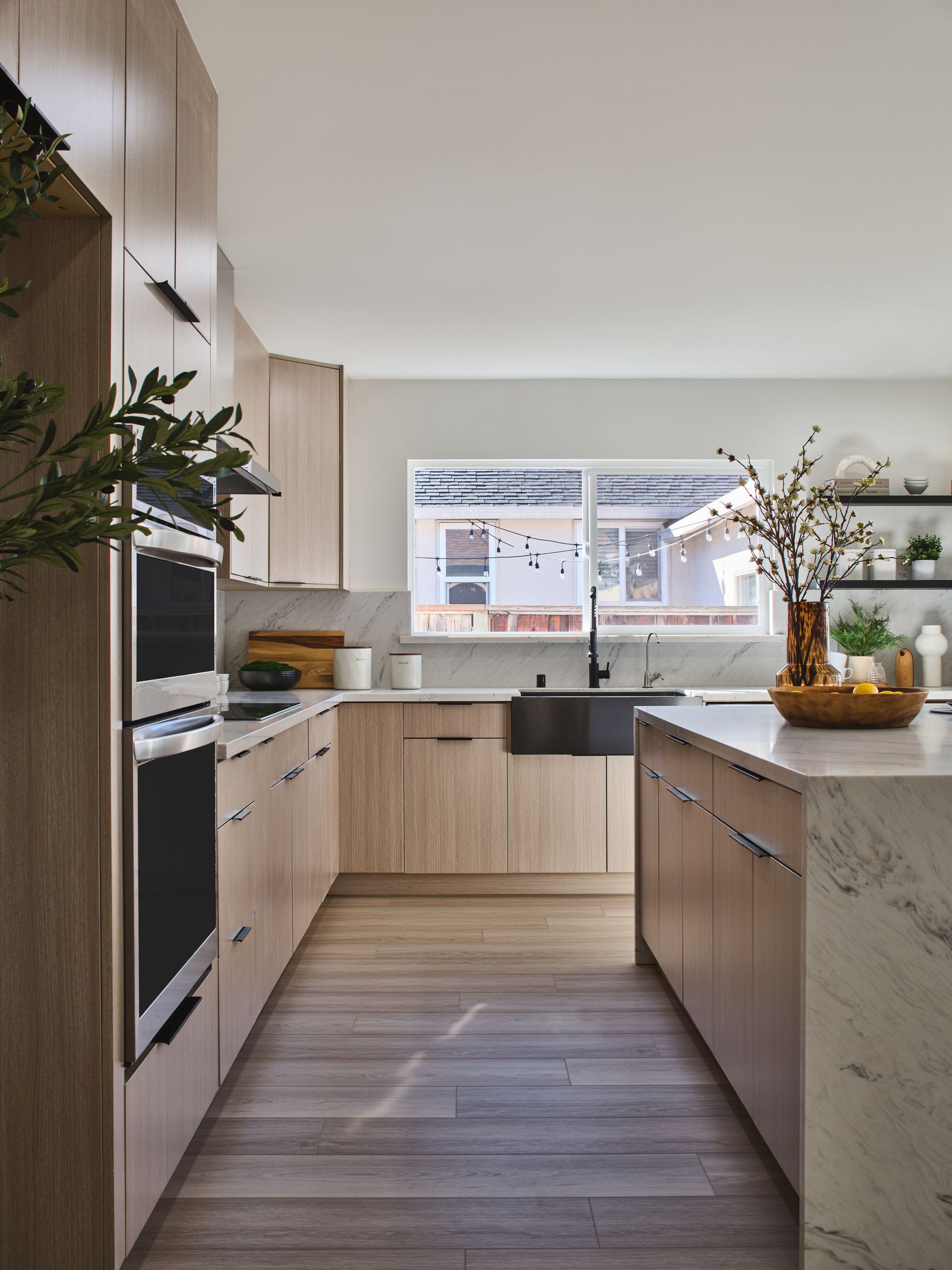
Bay Area home staging colors have moved away from icy gray walls, blue-white trim, and the old flip-house palette. Buyers still want calm rooms, but calm no longer means cold. The current shift leans toward plaster, limestone, mushroom, oat, warm putty, softened clay, and light taupe. These colors feel clean against white bedding, textured linen, and walnut or pale oak furniture.
This matters because most buyers see your home first on a phone. A cool gray room can compress into a dull rectangle, especially when the floor is also gray or the photo exposure runs bright. A warm mineral neutral gives the camera a surface to read. You see the edge of the wall, the depth of the hallway, and the shape of the window trim.
Use color as a quiet backdrop. In person, the wall should feel like dry stone, unbleached fabric, or a smooth ceramic bowl. If the room smells faintly of fresh paint and sunlight is cutting across the baseboard, the color should still feel settled, not sharp.
The Core Palette: Warm Whites, Oat, and Soft Taupe
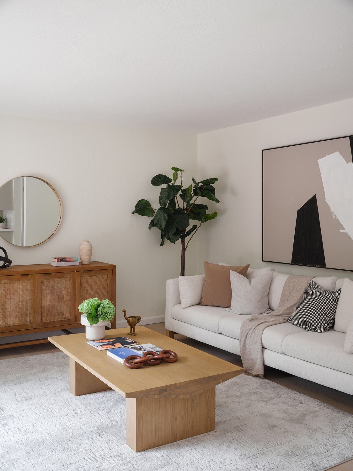
Neutral paint colors for home selling should make rooms feel maintained, spacious, and easy to furnish. For most Bay Area sellers, we start with three families: warm whites, oat neutrals, and soft taupes. They are not dramatic. That is the point.
Warm whites work well in homes with smaller rooms, lower ceilings, or shaded windows. Look for whites with a creamy or limestone undertone, not blue. The wall should feel like warm paper, not printer paper. Pair it with crisp but not harsh trim, and keep the sheen consistent so light does not flash across patched areas.
Oat neutrals suit open-plan living areas, newer condos, and homes with pale wood floors. They bring enough warmth to support a linen sofa, a jute rug, and black metal accents without turning beige in a dated way. In photos, oat walls often make greenery, books, and art look more intentional.
Soft taupe works in larger rooms that need weight. Think of wet sand, mushroom, or a cashmere coat in indirect light. Taupe can make a dining room feel grounded, especially with a walnut table and warm lamp light. Keep it light to medium-light for resale. Once taupe gets too brown, buyers start thinking about repainting.
Where Muted Color Helps: Offices, Bedrooms, and Powder Rooms
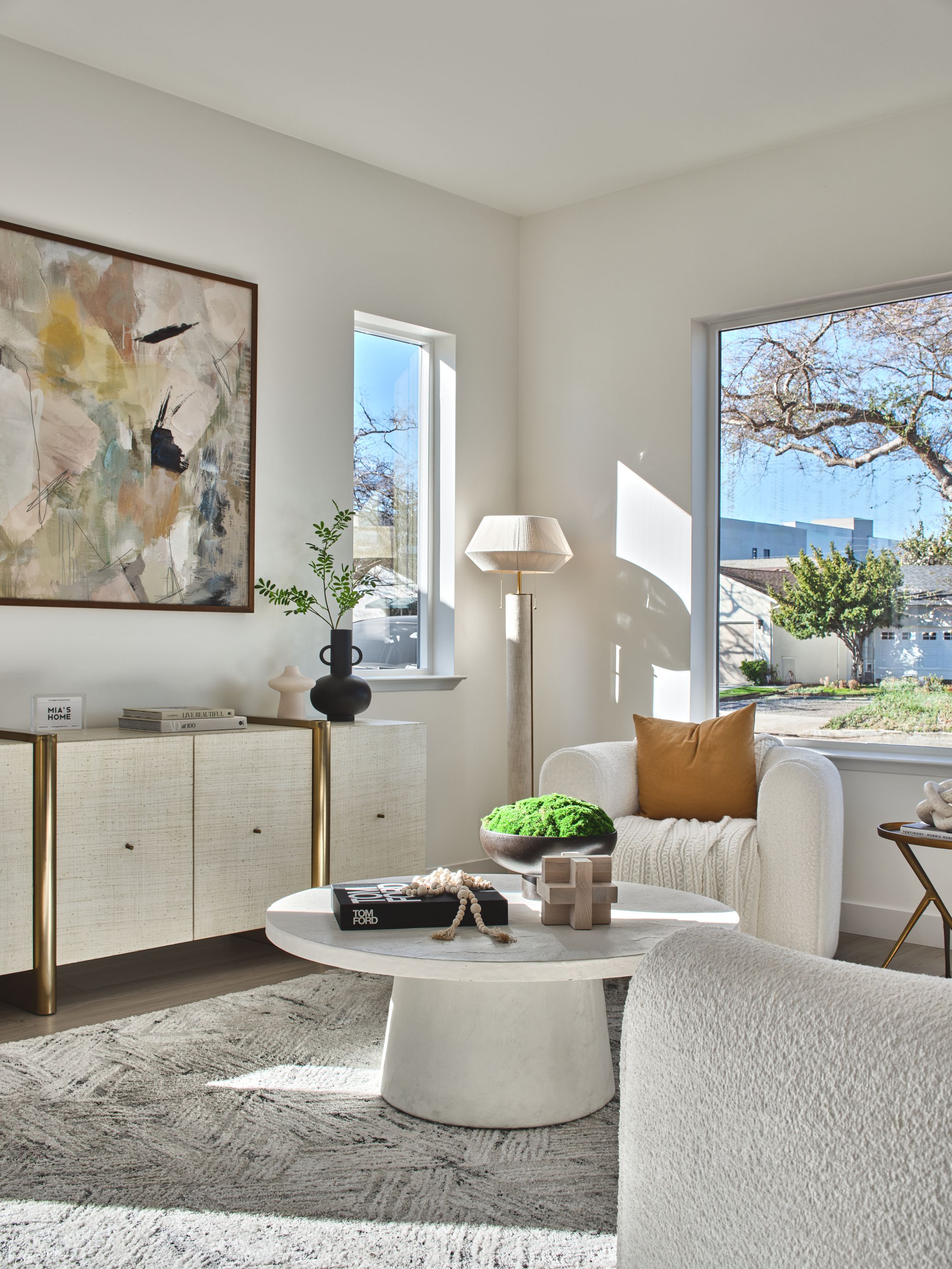
Not every room needs the same neutral. Summer 2026 design is allowing more muted color, but sellers should use it where it supports the story of the home. A smoky blue-gray office, a soft sage bedroom, or a powder room in muted clay can photograph well when the rest of the home stays calm.
In a home office, muted blue-gray can reduce glare from a desk setup and give built-ins more presence. The color should feel quiet, like a foggy sky through glass, not nautical or bright. Add a woven chair, a matte black lamp, and one simple piece of art, and the room starts to read as usable square footage rather than a leftover bedroom.
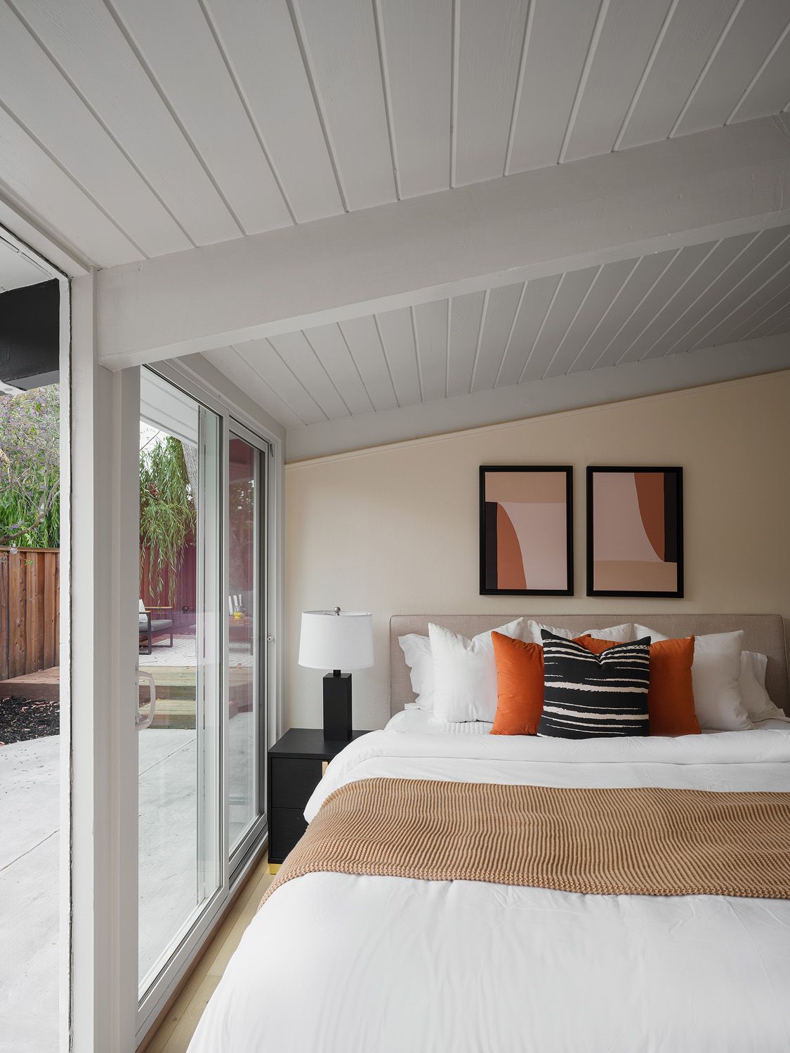
For bedrooms, soft sage or gray-green can work when the flooring has warmth and the bedding stays simple. The wall color should feel like eucalyptus leaves after the sun hits them, not mint candy. In the primary bedroom, we usually prefer the softer version of any color because buyers need to imagine their own linens, art, and routines in the space.
Powder rooms can take a little more depth. A muted clay, mushroom, or smoky olive can look polished with a stone countertop, a clean mirror, and warm sconces. Keep the ceiling and trim controlled. Small rooms amplify color, and the sound of footsteps in a tiled powder room already makes the space feel enclosed.
Colors That Fight the Camera
Some paint colors look nice in real life and still create problems for listing photos. Bright white can blow out around windows. Cool gray can turn blue beside warm floors. Yellow beige can make cabinetry look older than it is. Saturated navy, emerald, rust, and black can work in design magazines, but they often pull attention away from the room itself.
The camera dislikes conflict. If your floor has orange undertones and the wall has a blue undertone, the photo may exaggerate both. If your kitchen cabinets are creamy and the wall is bright white, the cabinets can look dingy. If your hallway has no natural light and you paint it deep green, buyers may remember the tunnel more than the layout.
Also watch sheen. A high-sheen wall in summer light can show roller marks, drywall patches, and old nail holes. Most selling situations call for a washable matte or low-sheen finish on walls, with trim just glossy enough to wipe clean. When sunlight skims across a wall, texture becomes visible. Paint will not hide poor prep.
The camera dislikes conflict: undertones, glare, and patchy sheen show up faster than buyers can name them.
A Room-by-Room Paint Plan for Bay Area Sellers
Start at the entry. This is where buyers adjust to the scale, smell, and light of the home. Use a warm white, oat, or pale greige that connects to the living room. If the entry feels narrow, avoid accent walls. Let the baseboards, door casing, and floor line guide the eye forward.
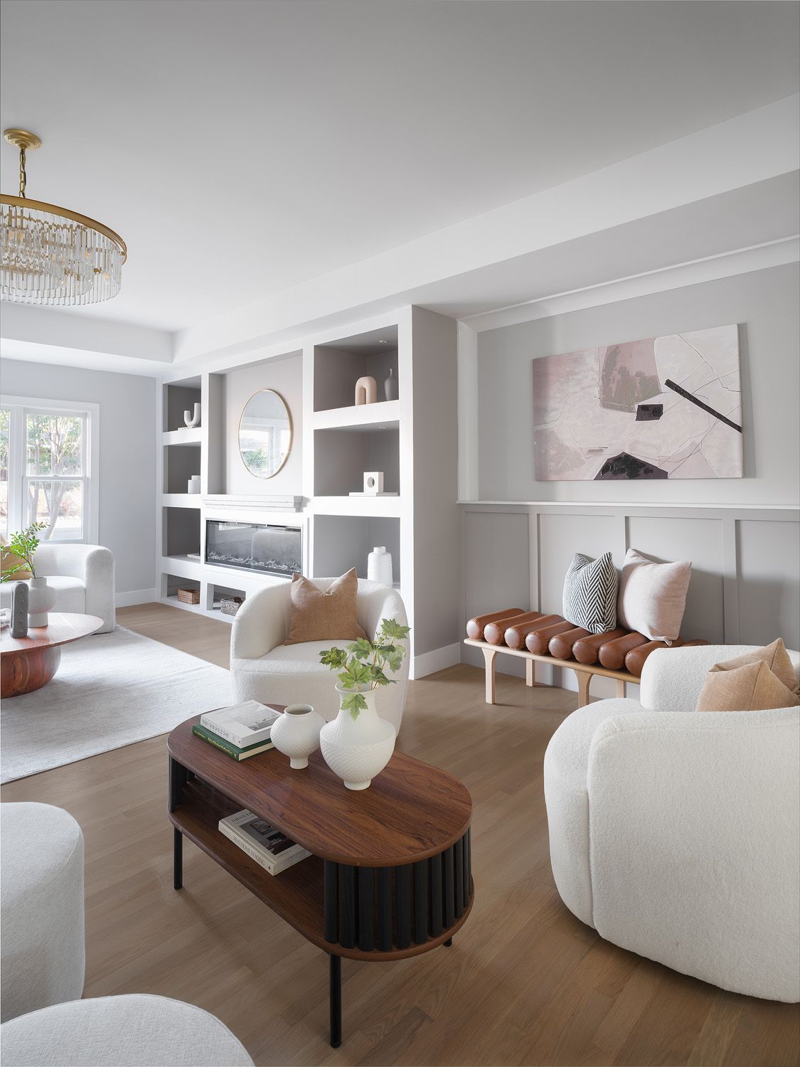
In the living room, choose the main neutral for the whole home. This room carries the listing photos, so test paint on the wall near the largest window and near the darkest corner. A color that works in both places usually earns its keep. Add staging with texture: nubby linen, a wool rug, ceramic lamps, and a wood table. The wall should support those materials, not compete with them.
In the kitchen, coordinate with fixed finishes first. Counters, backsplash, cabinets, and flooring matter more than trends. If the cabinets are warm white, avoid a cooler wall white. If the countertop has gray veining, a light mushroom or warm greige may connect the surfaces better than a plain white wall.
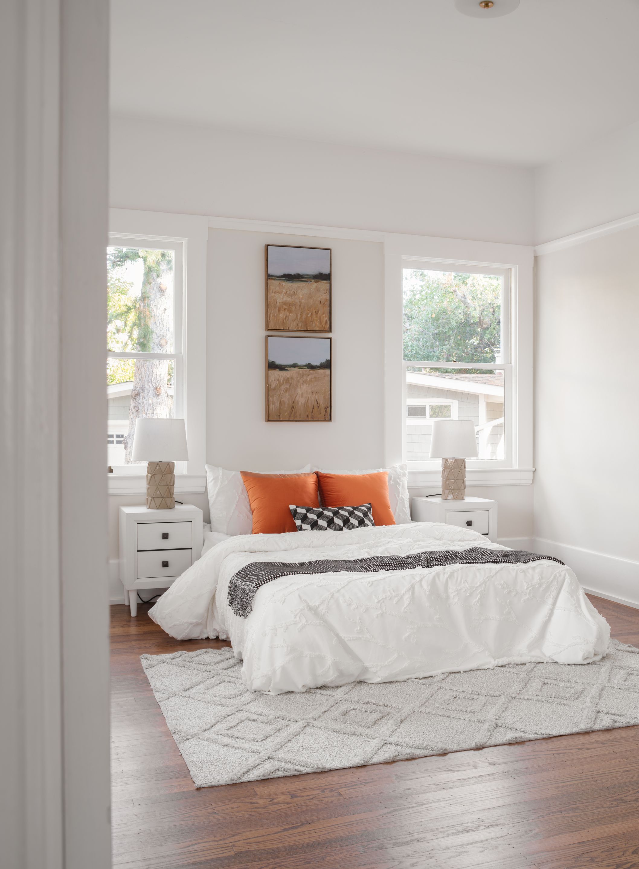
For bedrooms, keep the palette restful and simple. Warm white, pale oat, light taupe, and very soft green all work when they make the bedding look fresh. Avoid strong accent walls behind the bed unless the architecture truly needs it. A bedroom should feel quiet enough that buyers can hear the room, not the paint color.
Bathrooms need special attention because tile, mirrors, and overhead lighting bounce color around. If the tile is cool, choose a restrained warm white rather than a creamy beige. If the tile is beige, avoid blue-gray walls. Clean grout, fresh caulk, and a steady neutral wall color will do more for perceived value than a trendy shade.
Test Paint Like a Stager, Not Like a Homeowner
Homeowners often test paint by brushing one small square near a light switch. That tells you almost nothing. For selling, test larger swatches on at least two walls in the room, including one wall that receives direct summer light and one that stays shaded. Look at the color in morning, afternoon, and evening.
Place the swatch near the fixed materials: flooring, cabinets, counters, tile, and fireplace stone. Then bring in the staging plan. A warm neutral that looks plain on an empty wall may come alive beside a linen headboard, a black-framed mirror, and a pale oak nightstand. A color that looks rich alone may feel heavy once furniture arrives.
If you are repainting several rooms, keep the palette tight. Buyers should not feel a color change every time they turn a corner. A main wall color, a trim color, and one or two controlled supporting colors are usually enough. The home will feel more spacious when the eye moves without interruption.
This is also where professional staging helps. At Mia’s Home Staging, we look at paint with the furniture plan, photo angles, window direction, and buyer profile in mind. You can browse our recent work on the /portfolio page to see how quiet wall colors let furniture, light, and architecture do the selling.
Do Paint Colors Increase Home Value? Be Careful With That Question
When people search for paint colors that increase home value, they usually want a simple answer: paint this color, get a higher offer. Real selling does not work that cleanly. Paint supports value by reducing friction. It helps buyers trust the home, understand the rooms, and feel less worried about immediate work after closing.
Fresh, well-chosen paint can make a home feel cared for. The air smells cleaner. The wall corners look sharper. The art hangs against a surface that feels intentional. In listing photos, a consistent neutral palette can make rooms feel larger and brighter without making them feel empty.
Bad paint does the opposite. It creates little doubts. Why is that bedroom purple? Why does the hallway look dark? Why do the cabinets look yellow? Buyers may not say these things out loud, but they feel the friction. Then they mentally subtract effort, time, and money.
So the goal is not to chase a viral color. The goal is to choose a palette that photographs well, feels current in Summer 2026, and makes the home easier to say yes to. If you are preparing to sell, Mia’s Home Staging can help you align paint, staging, and listing photography before the first buyer walks in.
Frequently Asked Questions
- What is the safest interior paint color when selling a house?
- For most sellers, a warm white, oat neutral, light greige, or soft taupe is the safest choice. These colors photograph cleanly, work with common flooring and cabinetry, and make staged furniture feel more intentional.
- Are gray walls still good for selling a Bay Area home?
- Yes, but avoid cold, blue-gray walls unless they fit the fixed finishes. In Summer 2026, Bay Area staging is leaning warmer: mushroom, limestone, oat, pale taupe, and soft mineral neutrals tend to feel more current.
- Should I repaint the whole house before listing?
- It depends on the condition and color continuity. Repainting high-visibility areas such as the entry, living room, kitchen, hallways, and primary bedroom often matters more than repainting every closet or secondary space.
- Can I use accent colors before selling?
- Use a muted accent only where it supports the room, such as a home office, bedroom, or powder room. For main living areas, a consistent neutral palette usually photographs better and appeals to more buyers.
- Do paint colors increase home value?
- Paint alone does not guarantee a higher sale price. It can support perceived value by making the home feel clean, current, and easier for buyers to move into, especially when paired with professional staging and good photography.


